


NYC goes from “I” to “we”
New York City is transforming its famous logo to express the collective commitment of New Yorkers to their city. This graphic identity is designed to contribute to the renewal of the city affected by the recent pandemic.
Created in the mid-1970s, has “I ❤️ NY” come to an end with the launch of a new logo for the US city? On 20 March, the New York city and state authorities, together with the New York City Foundation, unveiled a revised version of the famous logo.
It may be a marginal change, but it is one that expresses a new desire. The American Typewriter slab typeface has gone, replaced by a stronger, bolder typeface in Grotesque Sans. The heart has been updated and emojised. Changing from NY to NYC puts the emphasis on the city at the expense of New York State.
But the main transformation comes from the shift from “I” to “we”. The individual statement has become collective.
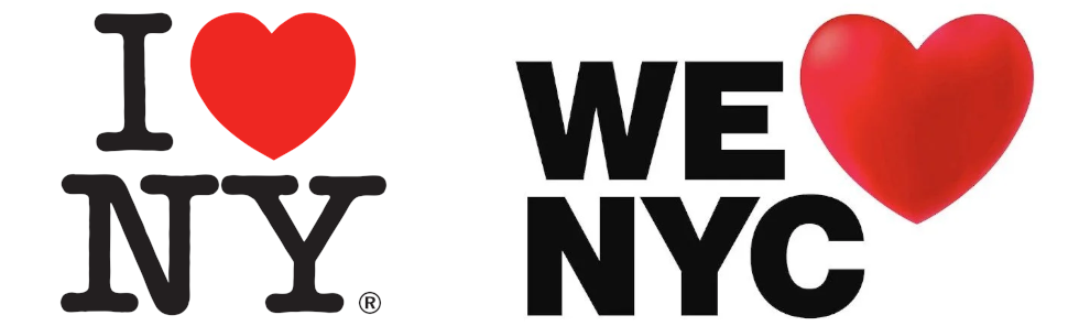
“We ❤️ NYC” expresses a desire for renewal, with the hope of “a rebirth of the city and its neighbourhoods after the pandemic”, according to city officials. The signature expresses the civic commitment and volunteering spirit of everyone, which must be recognised and encouraged.
As with any change of name or graphic identity, reactions vary. On social networks, the tendency has been to criticise this new design, which New Yorkers discovered somewhat abruptly. It is now up to “We ❤️ NYC” to be the flagship of the megalopolis of 8 million inhabitants, which is seeking to restore something of the American dream.