The graphic trends and territorial “branding” of French-speaking towns
Of the many changes of logo or visual identity recorded in the communities since 2020, my own monitoring effort identified similar initiatives in nearly 45 towns in Switzerland, Belgium, Luxembourg and Canada. Let’s observe a selection of logos of French-speaking towns that are particularly interesting because of both their initiatives and their results. These examples could be sources of inspiration for future changes of identity following the upcoming elections. 🙂
By Damien Pfister, director of communication for the town of Villeparisis, member of the Cap’Com Steering Committee.
Skyline in Arlon
Belgium - 31,310 residents
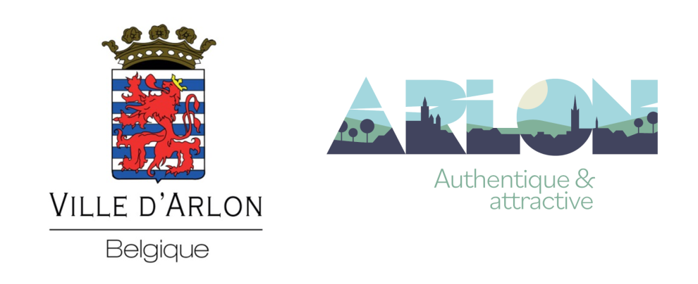
Arlon, which is situated in Wallonie, undertook to boost its visibility by developing a new graphic identity. The aim was to create an “impactful, efficient, accessible and recognisable” image while promoting its heritage. With the residents’ involvement and the support and guidance of Common Paradox, in tandem with Vous Agency, the idea of designing an identity based on a skyline rapidly gained traction and the latter was even included in the town’s name.
Heritage items and pictograms in Esch-sur-Alzette
Luxembourg - 37,922 residents
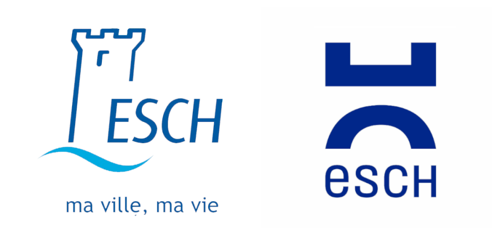
Presented in 2022, the new visual identity of this town, a major hub of the steel industry, aimed to instil “fresh life in order to more effectively reflect the commune’s soul and services”. It was designed at the conclusion of a participatory process and “converging opinions”, and was structured around the “main parts of the tower (medieval slot) and the Alzette river” revisited in a “more modern and dynamic way”. A set of graphic versions, in the form of pictograms, was also displayed, organised around nine thematic angles.
The post-Capital of Culture period in Mons
Belgium - 96,358 residents
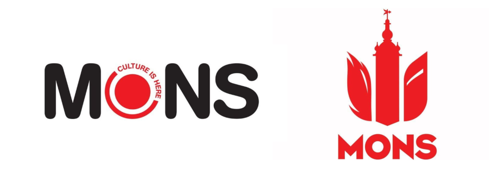
After having been a European Capital of Culture in 2015, the city of Mons had surfed on this dynamic by unveiling, in 2016, a logo steeped in this adventure. Five years later, a new identity has been developed by a Walloon agency. It aims to represent the city’s folklore, heritage and modernity, all while offering “a new graphic identity that is intended to be clearer, more representative, stronger and more in line with the different dimensions of life in Mons”.
The new logo is designed like a coat of arms and can be broken down as follows: the left-hand side evokes the dragon’s tail, symbolising folklore; the central part illustrates the belfry for the heritage; and the right-hand part represents the conference centre, embodying modernity. At the same time, another visual in the form of a “skyline” was also produced to round out this new identity.
A cool wave in Neuchâtel
Switzerland - 44, 597 residents
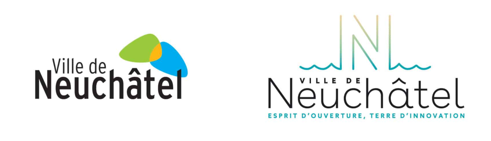
In 2020, the Swiss communication agency, Contreforme, designed Neuchâtel’s new visual identity. The logo depicts an N for Neuchâtel, open onto the horizon, evoking “the calming waves of a city in which it’s pleasant to live”. Its shaded colours – beige for heritage, green for nature and turquoise for the lake – symbolise the region’s richness. This remodelling brings a wave of cool air to the centuries old city. The Contreforme agency developed a very rich and complementary visual universe, in particular for the communes that report to it, but it was also enriched by “a series of pictograms and wave motifs added substance to the visual identity”.
To go further: https://contreforme.ch/portfolio/identite-visuelle-ville-de-neuchatel/
A committed graphic set in La Tuque
Canada - 11,129 residents
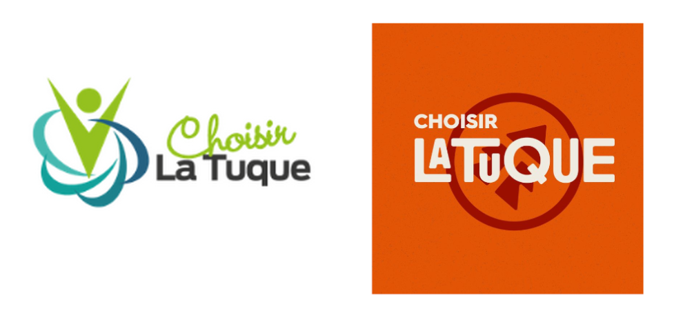
The city of La Tuque in Quebec undertook a complete redesign of its visual identity in 2023 with the aim of making its image look younger, simpler and more modern. Following a process of citizen consultations, the city unveiled a committed graphic ensemble. More specifically, the latter includes a powerful symbol of the Atikamekw and bears witness to an inclusive undertaking. The new tagline, “True both outside and inside”, also translated into the atikamekw language, embodies this vision. The graphic identity reflects, in full, the city’s values and ambitions, underscoring its unique character and rich multicultural heritage.
A “fleeting” logo in Sandweiler
Luxembourg - 3 ,751 residents
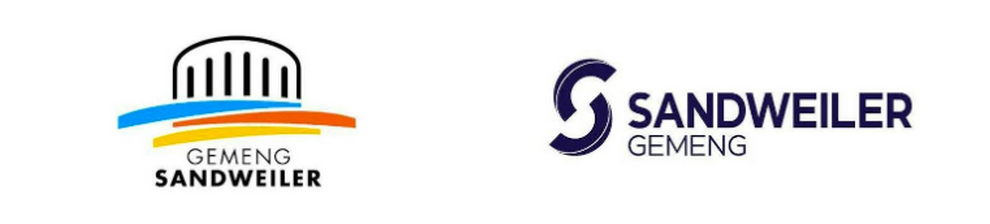
The town of Sandweiler presented its new visual identity in July 2023, just days before a political handover. The change sparked a controversy: not only did it erase the town hall’s characteristic circular shape present on the former logo, but the future elected representative also denounced the cost and the context of this decision, deemed “brutal”, and called on the residents to protest. And yet the outgoing administration had justified the graphics, explaining that “the circle represents the village’s central square”, around which village life is organised, including “the school yard and the town hall building”. Once on the job, the newly-elected representatives decided finally not to change the graphic identity. It might be the shortest change of a region’s graphic identity in history!
A logo without its cathedral in Cologne / Köln
Germany - 1,153,230 residents
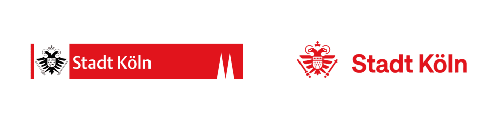
While not a French-speaking city, Cologne was a “French” city from 1802 to 1815. Cologne / Köln, the fourth-largest city in Germany, changed its visual identity in 2022. This change, motivated by the need to modernise the city’s image and adapt it to digital tools, was made after the municipal elections in 2020, which saw the political power change hands. The new, pared-down graphic design, and in particular the simplification of its coat of arms, sparked an uproar because the image of the cathedral’s towers had been removed.
Identities that call to mind French regions’ graphic identities
This is obviously not an exhaustive selection. However, these identities call to mind certain approaches adopted by French regions or even more global trends. In a world where regions must attract, energise and modernise without disowning their residents nor their history, this trend is certainly not specific to French-speaking regions. A word of caution, though: changing identity is never a simple decision to make and must never be treated lightly. A strong identity is an identity that lasts and is shared!